The Product Manager’s Guide to Drawing on a Whiteboard
How to become the superhuman who can draw confidently on a whiteboard
Are you terrified of whiteboards?
Just the possibility that someone might hand you the pen in a meeting and say ‘go on then, draw it’, sends a shudder down many spines. A bunch of self-loathing thoughts run through your head…
‘I CANNOT draw’
‘I’m useless at drawing’
‘I struggle to speak confidently in meetings, let alone draw on a whiteboard.’
‘The last time I drew something was with a crayon when I was 7 years old.’
‘This isn’t pictionary. Leave me alone.’
As product managers, it’s often up to us to convey ideas, build strategies, solve problems and understand technical restraints. The whiteboard helps us to visualise many these things and it is an irrational phobia of whiteboards which prevents some of us from using it to our advantage in situations where it would help facilitate better meetings. We don’t want to look like idiots so we instead gesticulate with our hands which often results in us looking even more ridiculous than we would by scribbling on the white board.
How often have you sat in a meeting with everyone flapping their hands around, waving their fingers and pens in the air trying to communicate some complex dependency or reason why a strategy will or won’t work. A picture can really help to facilitate meetings in a much more efficient way so it’s in our interests to become better at drawing on whiteboards.
If you can master a whiteboard, people will treat you differently; you’re the PM who writes on the whiteboard and solves problems efficiently. It’s a good thing to be known as that person. But first, you need to overcome your fear.
If you’re ever going to become a whiteboard ninja, you’re going to have to overcome that fear of whiteboards. And to do that you’re going to need to re-condition your fingers and your brain to feel comfortable with drawing.
You could splash out on some 1-1 cognitive behavioural therapy sessions with a personal therapist or you could get yourself a pen and a piece of paper and learn the ropes yourself 🙂
Too often, our days are spent staring at screens and we have forgotten how to put pen to paper. Remember when you were a child first learning to write? You developed your own hand writing style, you would spend hours drawing in art classes and you’d love to draw, without a care for what other people would think.
There are meditative benefits from drawing and it’s becoming increasingly popular for adults to take art classes purely for the meditative effects. It calms your mind, forces you to focus on 1 thing only and enables you avoid the temptation of opening 30 tabs in your browser and manically switching between them and other applications on your laptop, preventing you from focusing on deeper tasks.
Reunite with the pen
If you don’t have a pen and paper, go get some. These moleskin beauties are my favourite notepads to use. They’re approximately the same size as an iPad which for some reason makes them weirdly pleasing to write in; large enough to allow you to scribble some thoughts and images, but still small enough to fit into your rucksack comfortably.
Grab your pen, close your laptop and draw the first thing that pops into your mind, and become comfortable with using the pen again.
If you’re someone who uses productivity apps to manage your daily to do lists, try transitioning from digital apps for to-dos to using pen and paper to write your to do list instead.
Re-engage with pen and paper for a week or so and you’ll eventually overcome your fear of the idea of writing / drawing with physical instruments.
Spend 10 minutes or so drawing these on repeat:
- Parallel lines
- Dotted lines
- Squares
- Circles
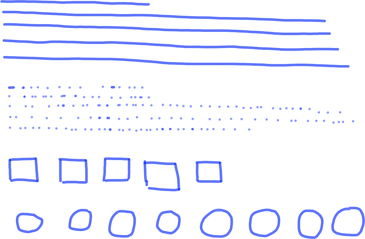
You’ll notice that after a few minutes you’ll feel relaxed. That’s one of the joys of putting pen to paper!
Draw some shapes on the whiteboard
OK, now that you’re comfortable with pen and paper again it’s time to transition to the dreaded whiteboard. If you don’t have a whiteboard at home (you might do but I realise this is slightly insane), instead use your boards at work to practice. Book yourself a room at a time when you won’t look crazy drawing on a board with no one else in the room and start drawing.
Pick up the board marker, smell it if you must (I’m addicted to them) and draw some basic shapes on the board. Pictures are made up of groups of smaller pictures pieced together so getting to grips with a few foundational images is a great way to get you started.
Once you’re comfortable drawing these Here’s a few to get you started. I’ve purposely made these drawings awful to make you feel better about your own skills. Honest.

A simple circle.

A tree. Doodling every day objects can be fun.

A square. Used for all sorts of fun.

A database. Use this to scare non-technical stakeholders.

Faces. Happy and unhappy.

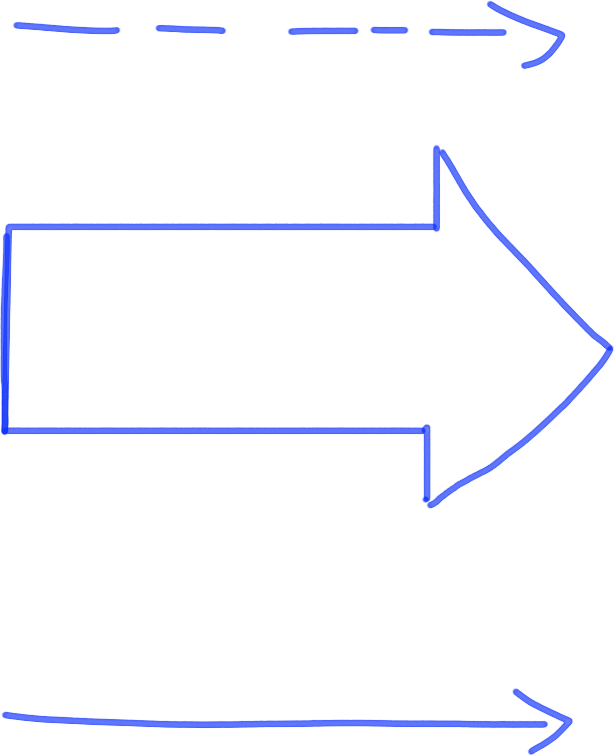
The arrow. Not just a weapon but a useful tool for demonstrating flow.
Frameworks to use
Unless you’re a bona fide artist, you’re not going to be particularly good at drawing, but who cares? Ask 10 people to draw a dog and you’ll get 10 variations of dogs with varying degrees of success. Some will look like the real thing, some will look like abominations and most will sit somewhere in the middle.
When you’re communicating, think about what objects might help you to tell your story. If you’re talking about a new CRM for your marketing team, what image can you use to draw the CRM or the members of the marketing team? If you’re building a reporting tool for customer services, how can you visualise your customer service team? Be creative, be memorable.
For each of these concepts, you could draw a simple object that represents the concepts in very clear terms that a child would understand. Creating objects on a whiteboard as part of a discussion helps you to make them tangible. Don’t be afraid of appearing unprofessional by doodling cartoons on a whiteboard; be self-deprecating and acknowledge that you’re not Walt Disney. It’s not unprofessional. Your colleagues will soon understand that drawing objects helps to clarify problems and bring ideas to life.
But objects aren’t the only way to clearly communicate ideas and solve problems. In fact there are a bunch of useful frameworks that can be used.
A key part of drawing on a whiteboard is to know what framework is suitable for the story you’re trying to tell or the problem you’re trying to solve. Before you start a session with a whiteboard, think about the kinds of frameworks that might be useful for solving a particular problem or communicating a specific idea. If possible, draw some before the meeting in your notepad so that you have a rough idea of the kinds of imagery you want to use beforehand.
Here’s a summary of the most useful frameworks to use on a whiteboard.
1. The who / what framework
Used to describe who or what it is you’re talking about.
– E.g. We are building a product for our customer service team, draw a picture of customer service team.
– Mobile app, draw a mobile.
What to draw
Turn your who or what into a tangible object.

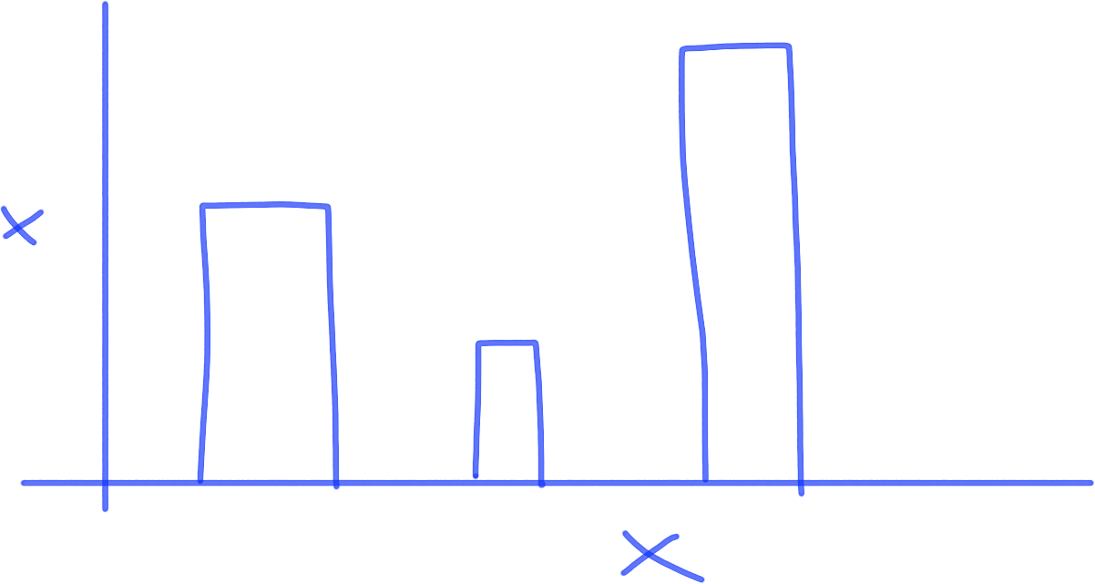
2. The how much framework
Used to demonstrate quantitative analysis and numerical impact of a feature or idea.
– E.g. What % of our users actually access the site on mobile?
– What % of revenue comes from subscriptions?
What to draw
Draw a bar chart, line charts or pie chart to clearly demonstrate numbers and compare /contrast numbers.
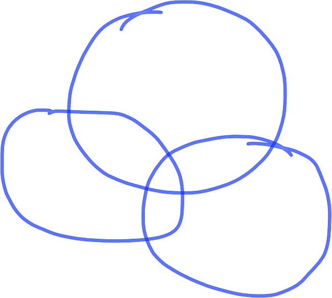
3. The where framework
Used to map relationships between interconnected parts of the business, ideas or people.
– E.g. What is the organisation of our development team and where are they located?
– How do the different user groups interact with each other?
– Who are the key decision makers in our organisation
What to draw
Draw a map to illustrate spatial relationships between 2 or more things.
4. The when framework
Used to convey timings and timeframes of projects, concepts, ideas or user journeys.
– What is the lifecycle of a customer?
– When does a user leave after onboarding?
What to draw
Use arrows to demonstrate timelines and flows.
5. The how framework
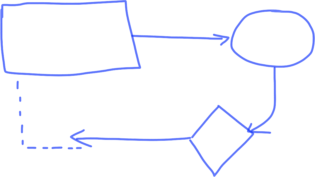
Used to articulate how things work. Useful for architectural diagrams and explaining to stakeholders how parts of an application are interdependent.
– How does our product connect to retailers via our API?
– How does a new feature get released?
What to draw
Draw a flowchart to demonstrate how things are interconnected and how processes work.
6. The why framework
Used to analyse why you should make a specific decision or strategic direction.
– Why should we prioritise this feature?
– Why is it important that we build a self-service tool for enterprise customers?
What to draw
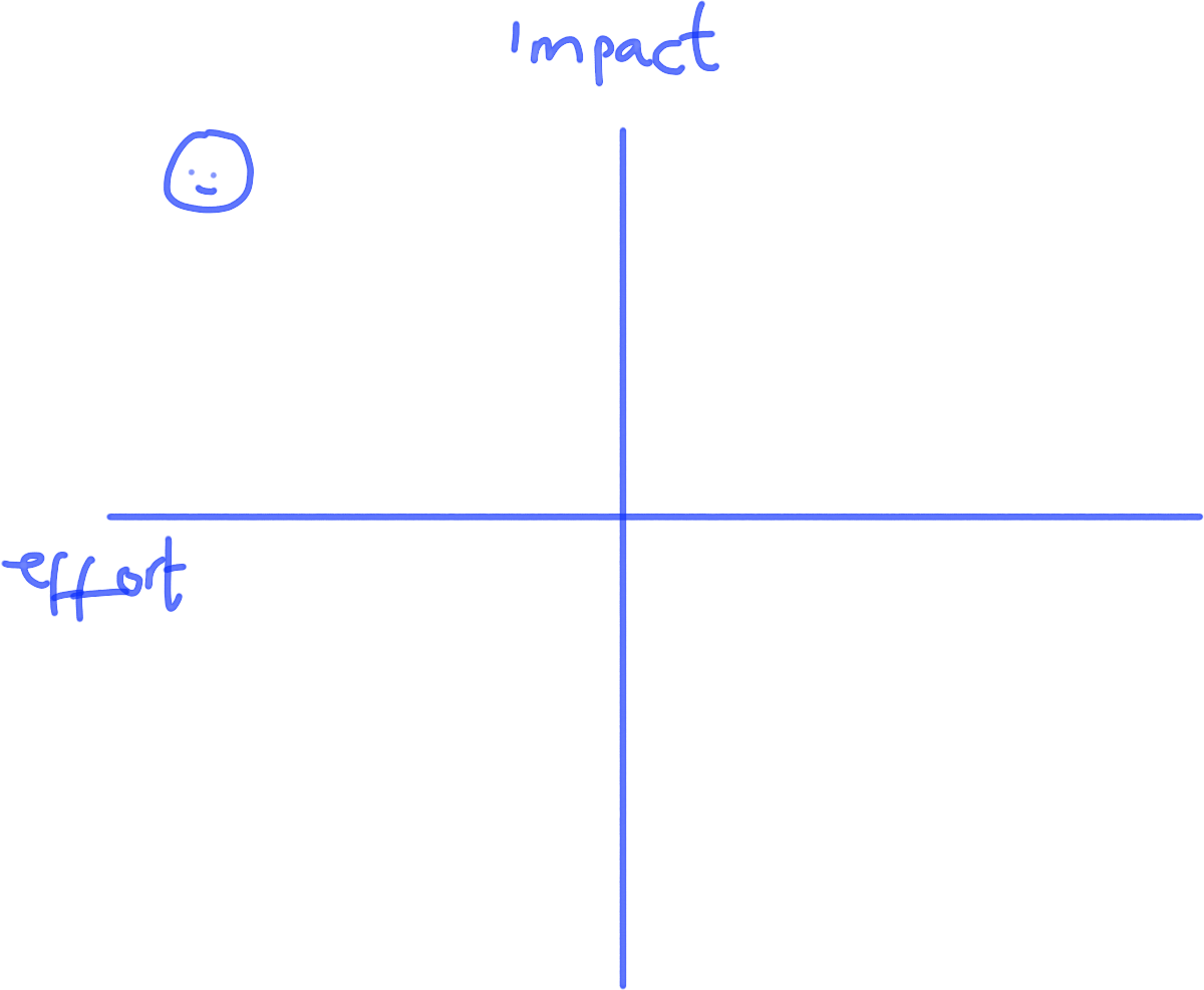
Draw a plot to help to visualise and compare based on specific axes. Helpful for strategic decisions.
Drawing UX components
In addition to solving problems and communicating ideas with your team, the whiteboard is the ideal place to draw some simple wireframe mockups when you’re discussing the pros and cons of designs. Like pictures, wireframes are individual components pieced together to create an overall visual experience. So what better place to start than to learn how to draw the most common components on modern web pages.
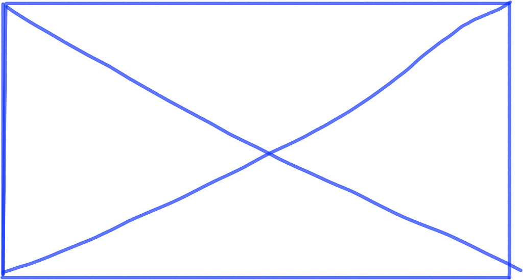
The image
A simple box with an ‘x’ inside to make it clear it’s an image, not a container. Used by UX professionals all over the world.
Text
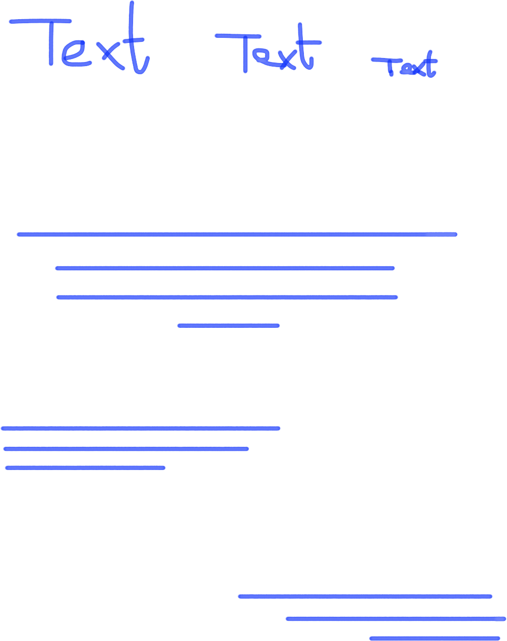
Text can be written as text for specific components on a page e.g. headers and buttons. Be sure to use hierarchy to differentiate between headers and subheaders. However, when you want to quickly mock up a few paragraphs of text you don’t want to write the prose yourself. Instead, draw some parallel lines. You can left justify, center or right justify parallel lines to create the idea of blocks of text.
Tabs
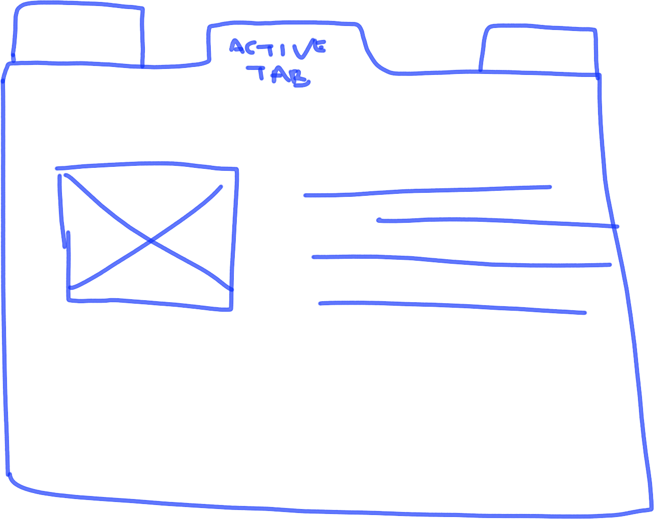
Tabs are commonly used to condense large amounts of information into a smaller space. The active tab should be the tab which connects to the outer container. Secondary tabs sit next to the primary, active tab. Put your content inside the active tab.
Buttons
Shading transforms this previously flat rectangle into a button. Don’t worry about being perfect with your shading; so long as the bottom and right hand side are shaded that’s enough to give it a 3d look which makes it clear it’s a button.

Tables
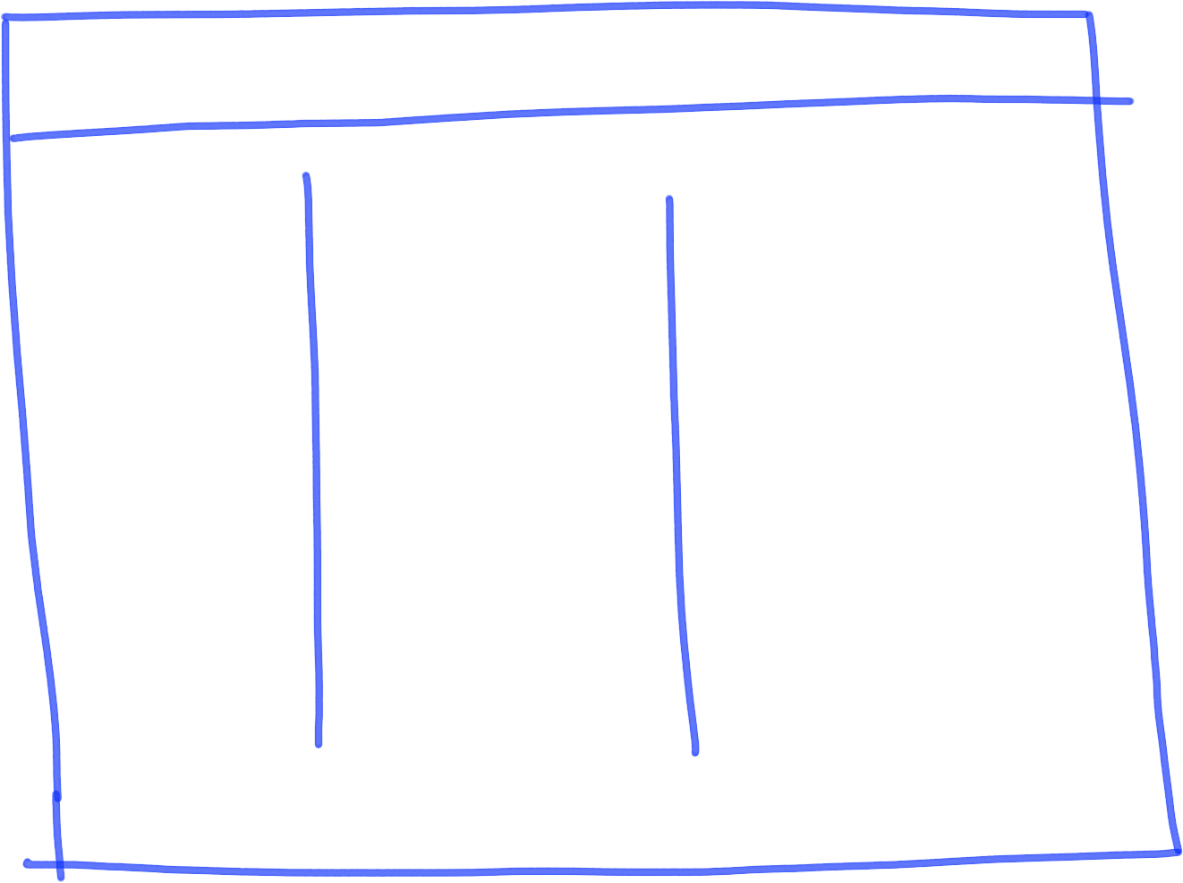
A box with a few lines gives you a table. Ideal for sketching products with data sets or reporting tools.
Sliders
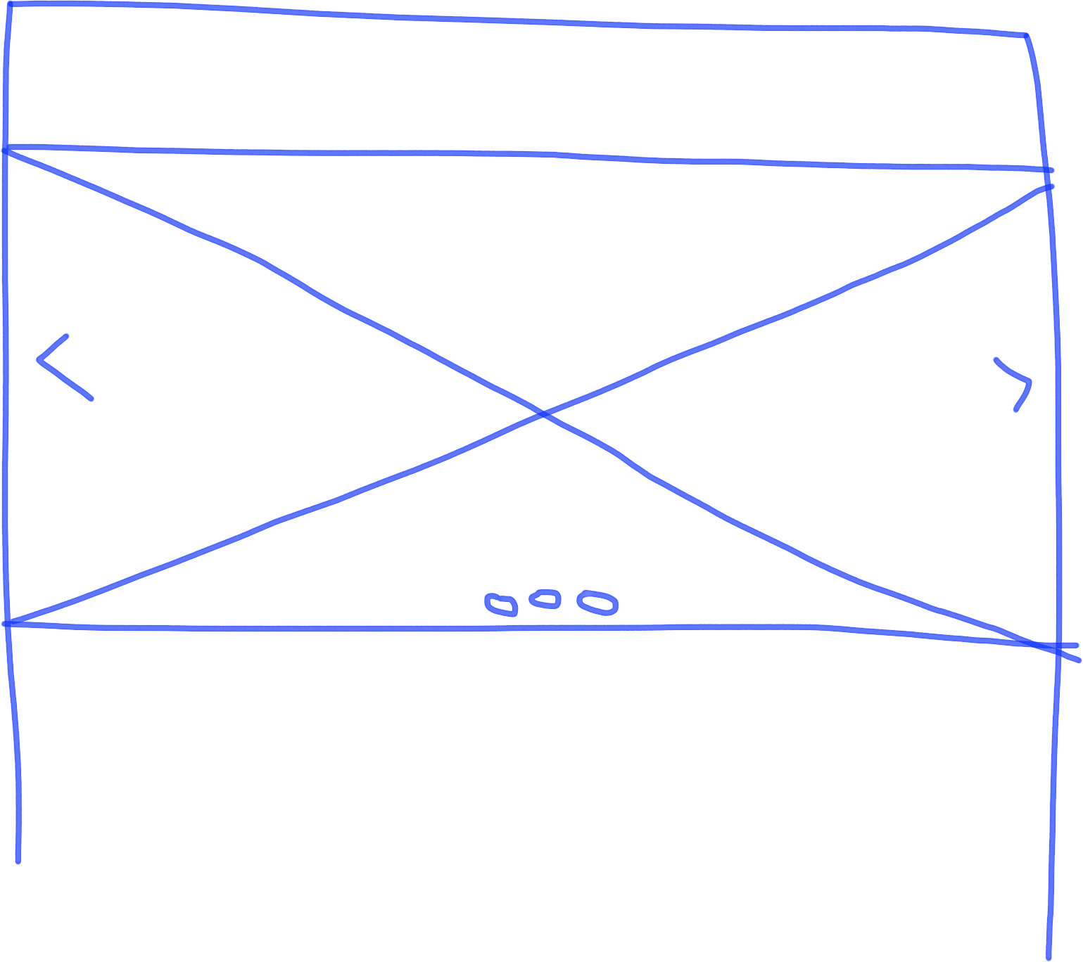
Take an image and add some arrows to either side and small circles onto the bottom and you’ve got yourself a slider. Typically used on landing pages / homepages. Add header text to display messaging.
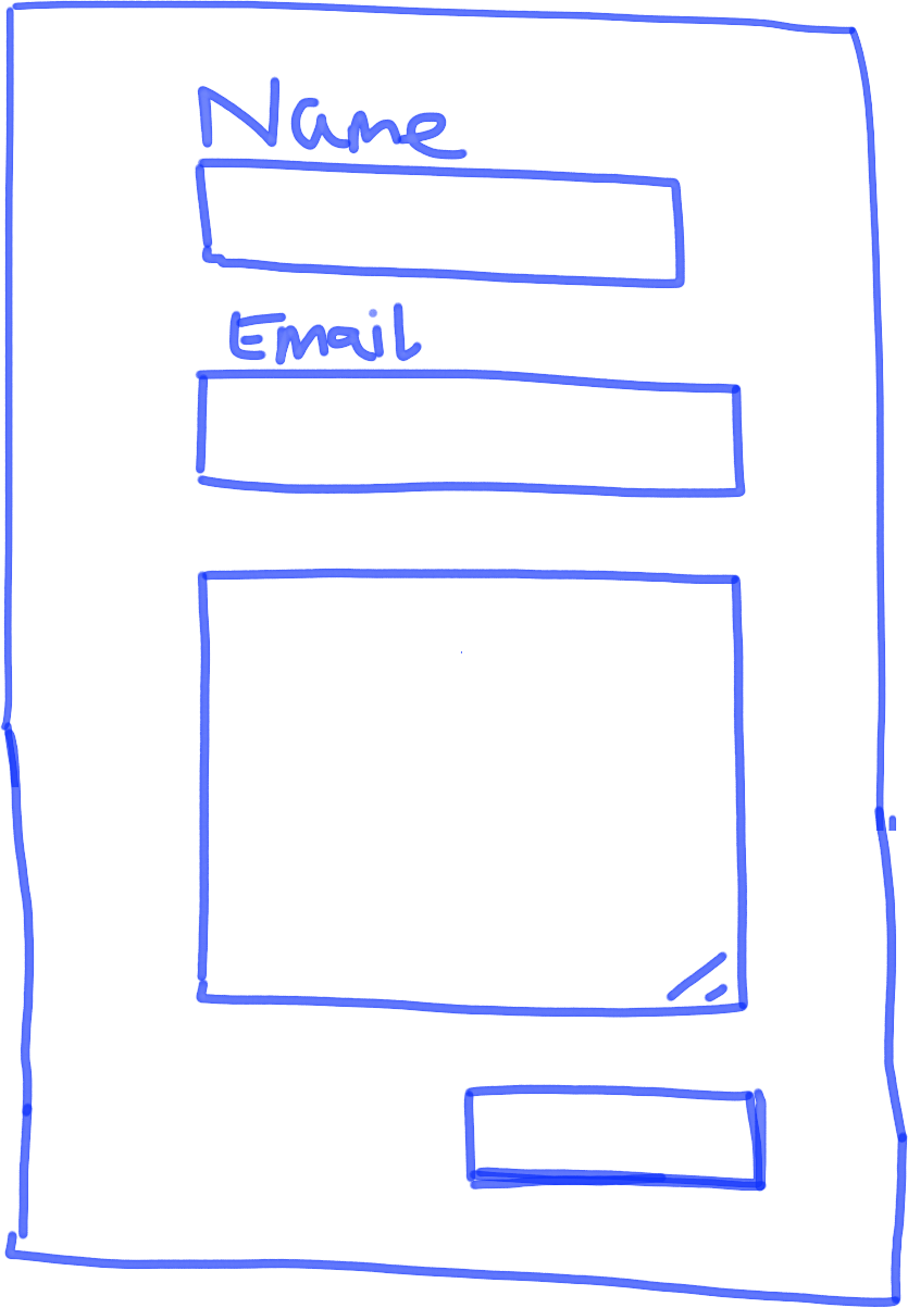
Forms
Differentiate between form fields and text input by adding a few lines in the bottom right hand corner of the text input box. Use shading on the button to make it clearly stand out from the rest of the form fields.
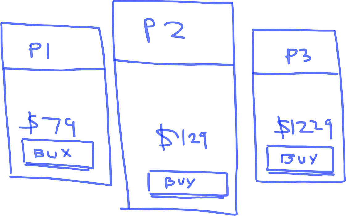
Pricing tables
A series of rectangles typically used to show product pricing. An easy way to make it clear these are pricing tables is to make the rectangle in the middle larger than 2 next to it on either side. That immediately makes it clear these are pricing tables and not just rectangles. Add pricing and buttons for extra effect.
Social sharing
Facebook, twitter, instagram, youtube logos followed by the word share makes it clear what you’re talking about.

Toggles / accordions
These are commonly used for condensing larger chunks of information into more easily digested bitesized chunks that can be accessed on demand by clicking to expand. Always show one open toggle and add a ‘+’ and ‘-’ sign to make it clear that these are toggles.

Drop down
Simple rectangle with a square and an arrow inside it and some text.

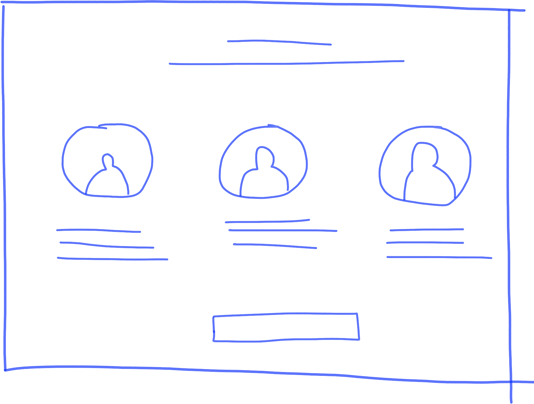
Blurb / testimonials
A simple 3 column page layout with images and blurb text underneath will help you demonstrate a commonly used landing page layout for testimonials or product description blurb.
Bringing it all together
Here’s some examples of how to bring all these components together. Seemingly complex diagrams can be easily broken down into their constituent parts.
Example 1 – architectural diagram
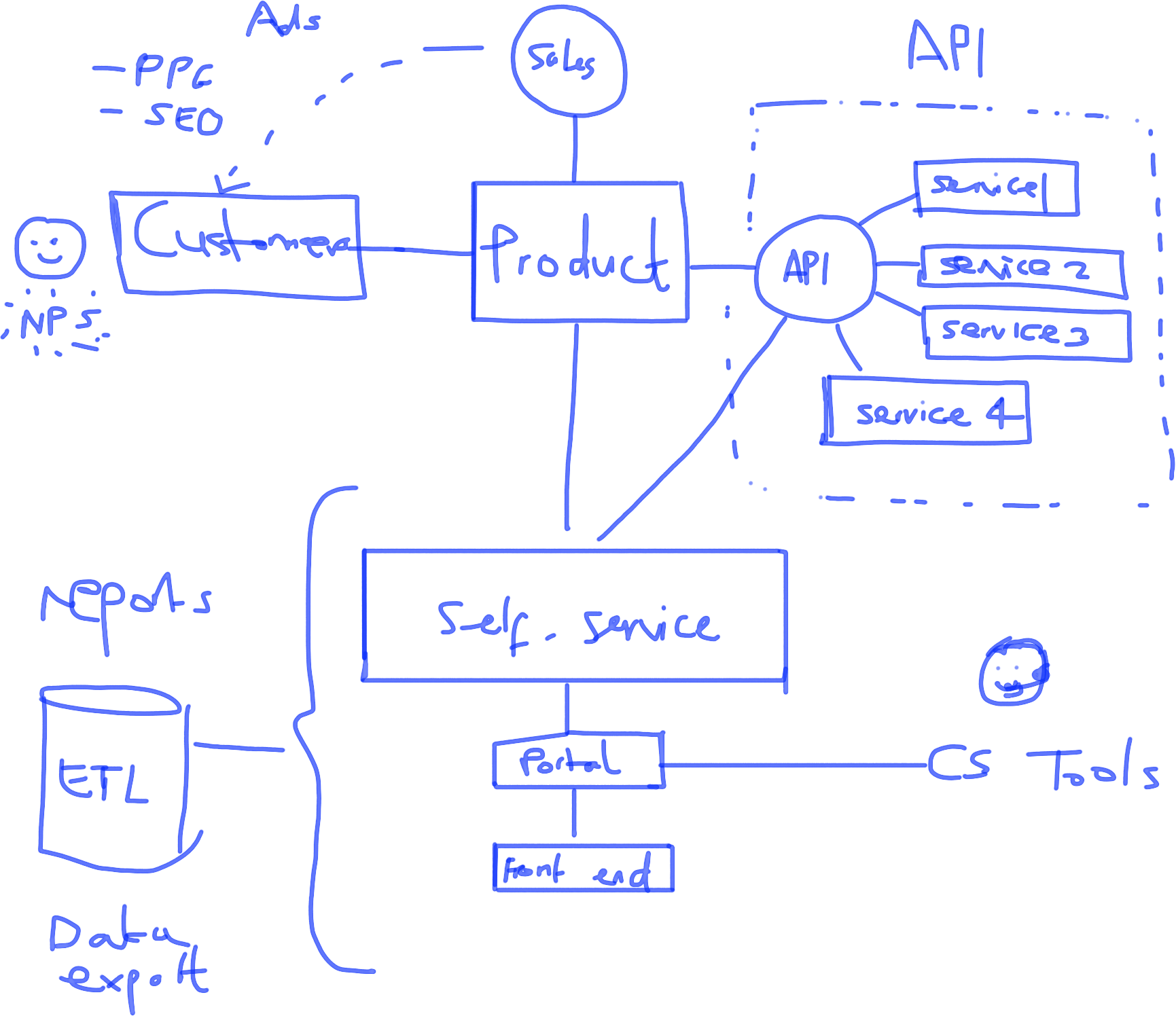
If we break this down we can see that this architectural diagram is comprised of:
- Circles
- Squares
- Rectangles
- Smiley faces
- Text
- Database
- Dotted lines
- Faces of customer service team
- Straight lines
Congratulations, these are the things we just learned how to draw! 🙂
Example 2 – landing page
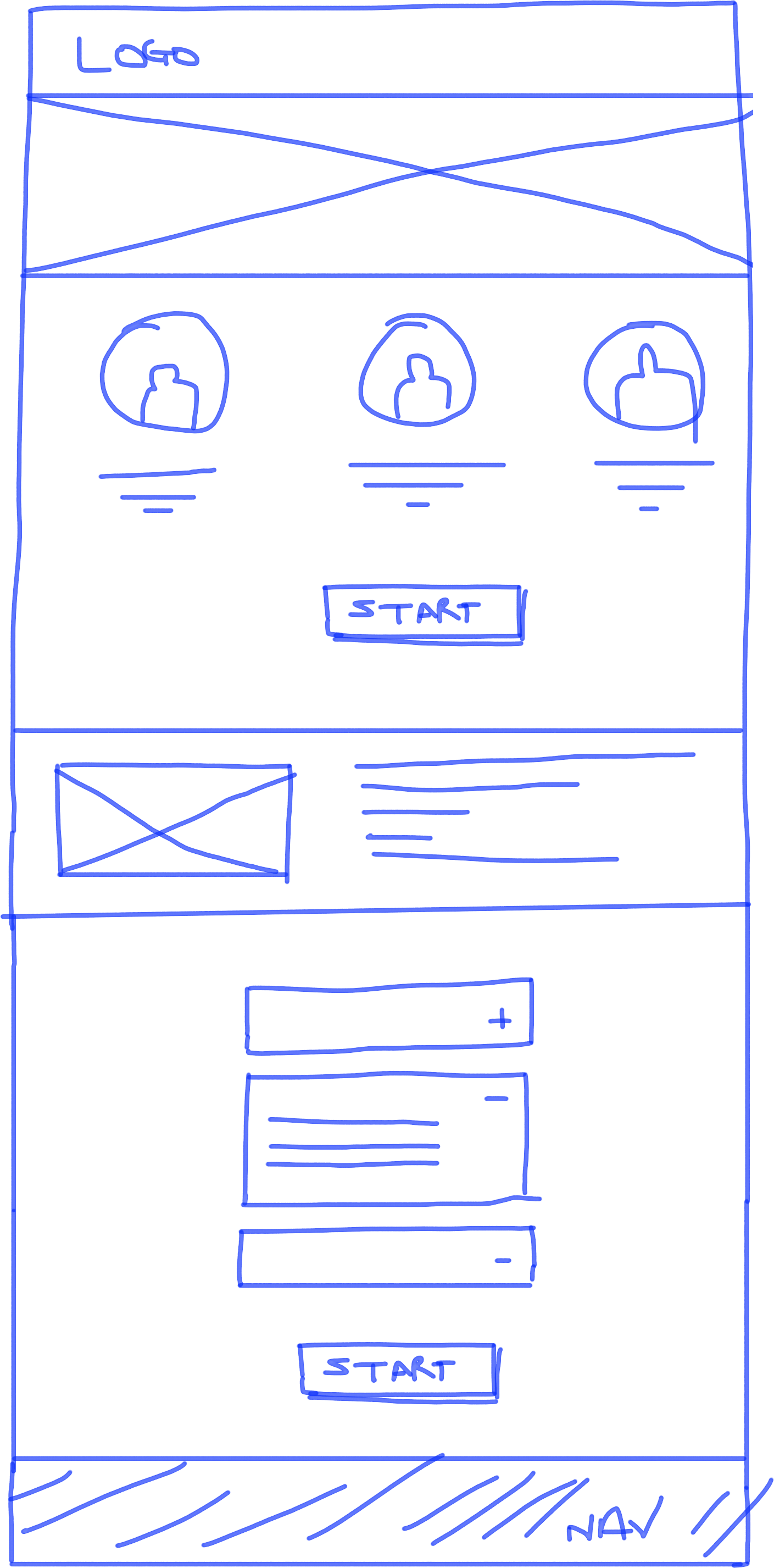
It’s nice to be able to quickly whip up a landing page on a whiteboard. Let’s look at what components we have here…
- Rectangles
- Image
- Centered text
- Left justified text
- Toggle / accordion
- Buttons
Not so difficult when you break it down into components, eh?
So what now?
Well, if you can master all of the pieces we’ve just outlined you’ll have a pretty impressive toolkit at hand when it comes to drawing on your whiteboard. As with anything, the more you practice these things the more competent and confident you will get. Confidence is everything when it comes to drawing; the more confident you feel, the more effective your communication will be, even if your drawings themselves aren’t masterpieces. It’s the combination of drawing and speaking clearly that creates an overall sense of clarity which enables you to solve problems and frame challenges in creative ways.
Of course, not all meetings necessarily need a whiteboard; if you’re in a meeting with some external clients or with some senior bods it might not always be appropriate to start doodling furiously. However, if you find yourself in a room full of people flapping their hands around furiously without making much sense and you get the impression that an image would help achieve the meeting’s goals more efficiently, grab your pen and get drawing.
Enjoy it. It’s your new superpower.

