5 Visual Design Principles for Product Managers
Practical ways to improve your design skills when you’re not a designer
As a product person burdened with the pressure of building valuable things people want to use, you’re expected to juggle multiple hats and skills without having the time and space to become a master of one. Some product people, like many people generally, will naturally gravitate towards one of the 3 holy trinity skills PMs are expected to have: technology, business and design. Others will have no deep spike in any one of these areas. And that’s OK.
This summary is for product managers and tech workers with no formal design skills who want to brush up on their design sense and learn some basic design principles, so that they can have more confident conversations when working with design teams.
We’ve put together what we think are the 5 most useful design principles to be aware of a product manager. Let’s have a look.
1. Color

When UX and UI designers are separated into two roles, designers sometimes get jokingly mocked for being the people who do the ‘coloring in’. Clearly that’s nonsense, but rather than dismissing the tongue in cheek insult by defending all of the other valuable things designers do, an equally legitimate retort might be to explain the power of color in product design. Even if a designer was indeed responsible for just ‘coloring in’, there’s plenty of value in the skill in using color effectively.
Color theory is the idea that the strategic choice of colors can influence behaviour and illicit feelings in people. So how does this impact product development?
Examples of where color choices matter in product development
- Branding – color choices are typically derived from your brand strategy. If your business has no brand strategy, it’s almost impossible to choose colors for your product. A brand strategy is more than just a logo; it tells the story of who your company is, what matters to you, what personality you have and what you believe in. A logo is a reflection of those values and the colors you choose for your branding will impact the overall feeling of interacting with your product.
- Design systems – a design system should be aligned with your brand strategy. Fonts, re-usable components, buttons, form fields and other UI elements will need to be aligned to your overall brand strategy and color plays a major part in the overall design system.
- Accessibility – almost 8% of men and 1% of women are technically color blind. The most common form of color blindness is red / green color blindness which makes it difficult to distinguish between blues and purples. In a product context, allowing users to choose color themes can help users with color blindness.
- Conversion optimisation – Marissa Mayer, then product manager at Google, famously tested over 10,000 shades of blue used in advertising links to increase conversion. It worked, and the winning shade of blue ultimately brought in an additional $200m for the giant.
On a practical level, having an awareness of the impact that color choices can make is helpful. And conducting user testing with real users where you provide alternative journeys with no changes other than colors will help to demonstrate the role that color plays even further.
Color and cultural awareness
The color blue is cited as one of Americans and European’s favorite. Ancient Greeks, however, scored blue as ugly and barbaric but throughout the ages. In the modern era, blue has become synonymous with royalty and the virgin Mary.
In Japan, yellow represents bravery, wealth and refinement. In 10th century France yellow was the color of choice to represent jealousy, betrayal and weakness. In China, yellow is the color of pornography and erotisicm.
Needless to say, when you’re deciding which colors in your products, cultural awareness is something to consider before blindly entering new markets.
2. Hierarchy
Hierarchy is baked into the technical foundations of the web.
The document object model (DOM) is a representation of all of a page’s HTML elements, organised hierarchically.
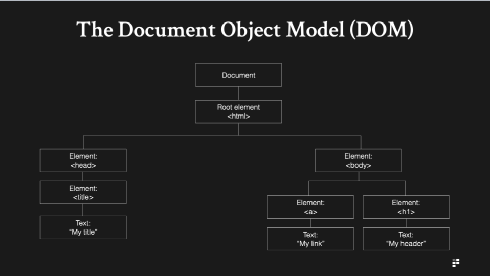
HTML has an in-built hierarchy where elements exist in relation to other elements on the page. All HTML elements sit inside the <body> tag. <h1> tags are the first header tag, <h6> tags are last. <li> tags are nested inside <ul> and <ol>, and so on.
In a design context, hierarchy is used to position elements on a page according to their relative importance. Before starting any new piece of design work, you can practice your hierarchy skills just by using circles. What’s using circles?
Using circles to agree hierarchy
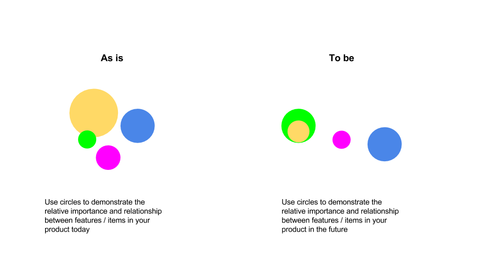
If you’re ever building new landing pages or indeed new pieces of functionality in your product, firstly decide on what’s important by agreeing on the hierarchy of each element.
Once you’ve agreed on the hierarchy of elements you can then start to work on the visual designs. Having a copy of your hierarchy circles document can help to influence stakeholders as it can be used as a reference point later when stakeholders tell you what they’d like changing which contradicts previous agreements relating to the relative importance of each element.
Hierarchy and typography
Typography is also based on principles of hierarchy. In a typographic context, hierarchy is used to help users scan the page. Check out any news article on a website and you’ll quickly see hierarchy woven deeply into the design of the article. The headline comes first, a subheader next and the text of the article is last, with a font size smaller than the elements preceding it. Hierarchy helps you read better. And it’s not just editorial sites that do this, either. Here’s how Spotify displays an album:

You’ll notice that the album and artist names are the most important elements on the page.
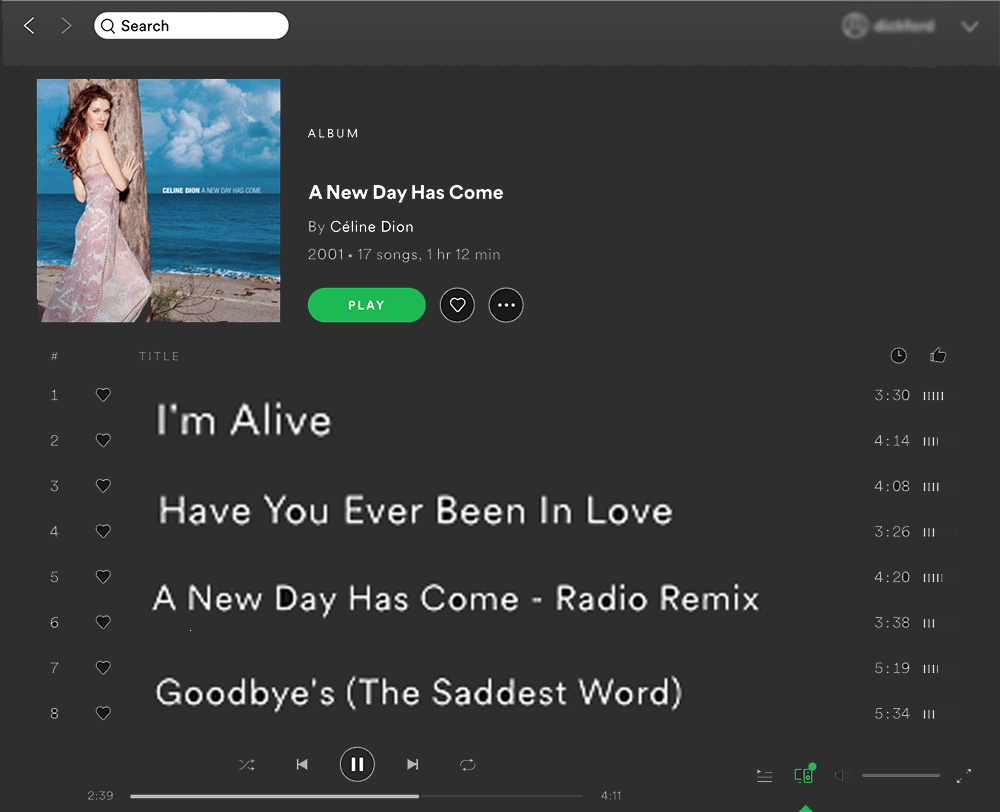
Now let’s look at what happens when we flip the hierarchy of text elements of a page on their head. You can still read the text on the page, but it just feels wrong.
3. Contrast
Contrast is used to make specific elements stand out more than others. Some obvious use cases for using high contrast include:
- Buttons – the clearer the button stands out on the page, the better.
- Validation messaging – using red to denote error messaging is a form of high contrast design.
- Text – you’ll always want text to be legible. One of the safest ways to do this is to choose background colours and text colours which compliment each other and increase legibility.
As you build out new pages and new features in your product, scan your designs for high contrast opportunities. Contrast also has accessibility implications and getting your team into a healthy habit of using tools such as WebAIM’s accessibility checking tools is certainly not a bad thing.
On a more practical process level, when you’re conducting workshops, presenting or writing on whiteboards, try using high contrast to illuminate points which matter more to your audience.
4. Proximity
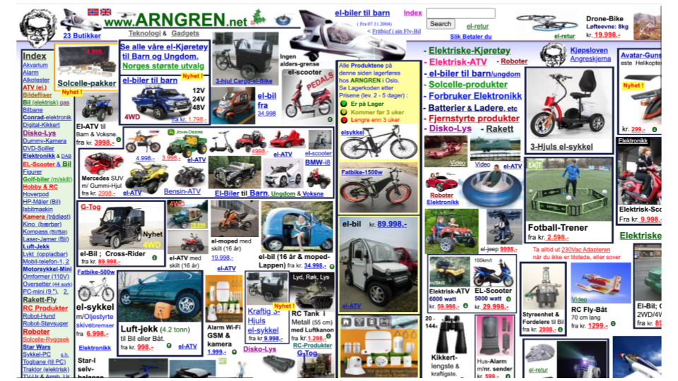
Look at this.
This is a real, legitimate website. It’s the infamous arngren.net/. It’s wildly entertaining but it’s also pretty hideous to look at. Why? Well, one of the main reasons is clearly that everything is lumped together into one big pile of random illegible gunk. It’s certainly garnered somewhat of a cult following over the years and that might be a strategic branding decision you make as a company, but designing pages like this is a bold one – and it risks alienating many users in the process.
The proximity principle dictates that similar items are grouped together to make things easier for users to understand. In reality, this could mean:
- Navigation – elements on a page relating to navigation should be clustered together.
- Search and filters – if I’m searching for something, it’s likely I’ll want to potentially drill down deeper into my results. Placing filters near search tools might help me during this process.
- Pricing tables – on marketing website landing pages, information relating to pricing is grouped together in a pricing table so that I know exactly where to go to find out more information relating to pricing.
Categorisation according to proximity
When designing new features or building out new pages for your product, a useful way to know if you’re applying the proximity principle is to color code the elements on your page. Firstly, list out the various categories and color code elements relating to the job they do for the user. Group common tasks together to make it easier for users to orient their way around core product tasks.
Similarly, proximity categorisation can be used as an effective auditing tool for existing product features. Take a look at existing designs and categorise them according to the jobs they perform and explore ways of applying the proximity principle more forcefully to make it easier to understand.
5. Balance
When designers are juggling multiple elements on a page, finding the right balance between all of the various elements is a challenge.
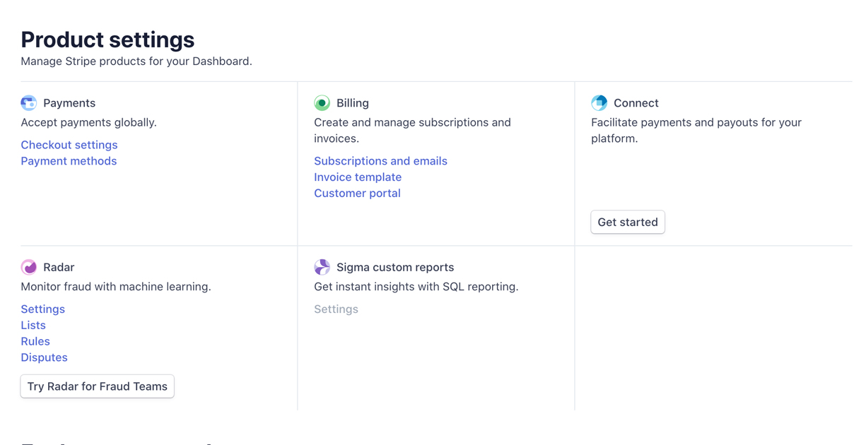
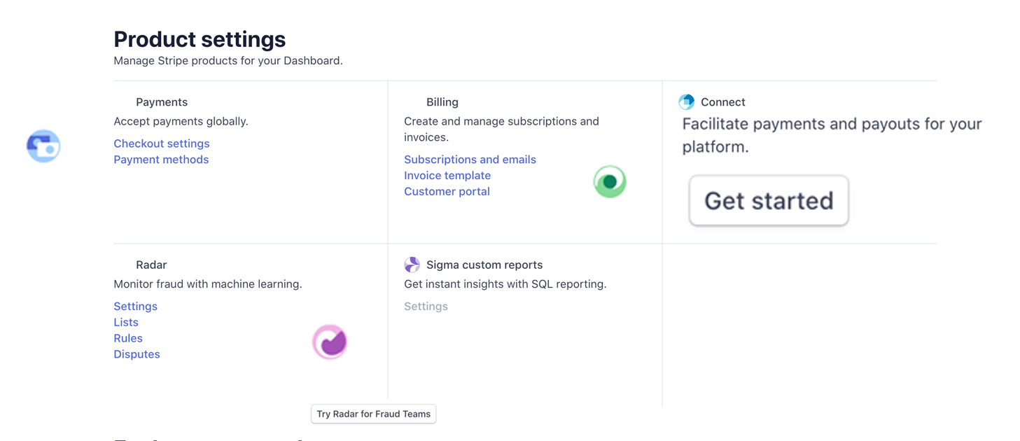
In this example, the elements on the page are exactly the same and the functionality is exactly the same, but the balance is skewed by distorting the size and shape of various elements on the page. It’s true that the page contains all of the same elements but by just tweaking a few things which put elements out of balance, the page feels wrong – and is more difficult to process at a glance.
Basic examples of balance in practice
- Headers and footers – in addition to providing users with valuable information, headers and footers are a natural way to add balance to the overall experience of reading a web page.
- Elements on landing pages – grid systems and 3 column grid layouts like those used in landing pages are a common example of using balance in practice.
Balance is typically categorised into symmetrical balance, asymmetrical balance, radial balance and mosaic balance. You can read more about the different types of balance in detail here.
How to use imbalance to influence decision making
But designing with balance isn’t always the right thing to do in a product context.
Imbalance can also be used in your favour, and there are times design teams will actively decide to make specific elements feel less balanced to influence behaviour:
Anchoring towards pricing
Anchoring when presenting pricing uses imbalance to its advantage. Anchoring purposely distorts the elements in a pricing table to make one package or price stand out as the most attractive.
Action buttons
Action buttons like the floating action buttons made famous by Google’s Material Design are by their nature adding imbalance to the page. They are often purposely placed above the content – in effect a form of adding imbalance – to make them stand out clearly.
Putting your design skills into practice
Understanding the theory of design principles is one thing but putting them into practice is another.
Whilst nobody is expecting you to produce the next iteration of your product’s visual design, it does help to use opportunities to put into practice some of the principles we’ve covered here.
Whether you’re critiquing a new landing page, debating the merits of a rebrand with your marketing team or indeed just putting together a deck for internal stakeholders, design principles are universal and can be applied to just about any asset you interact with on a day to day basis. Design is more than just coloring in, after all.

