Making Sense of Usability Test Results
Usability not user ability
It’s important to remind yourself that when you’re conducting usability test it’s your product and not the users themselves that you’re testing. In other words, it’s the usability of your product and not the user’s ability to figure out how to use it that’s being tested. If a user is confused about where to register, how your product works or why they’re being asked to pay using their face, this is likely a symptom of a problem with your product’s design and not the user.
If you’re to learn anything from usability testing, try to put aside the voice which is telling you that all is OK and that this user is likely an anomaly and instead listen and learn to how your users are actually using your product in all its gory reality. Yes, some users will do fairly disturbing things like use the caps lock button to capitalise letters mid-sentence but that’s the reality of human behaviour. We’re all odd.
Why bother with usability testing?
We all know that we should be conducting regular usability testing, but it’s a task that often feels like a chore. Avoid taking on the burden of coordinating usability tests yourself; enlist the help of your UX / design / front end team and ensure that the entire product team (including the engineers) feels responsible for both the facilitation and the outcomes of usability testing. The outcomes of usability testing are an assessment of the entire product team’s performance.
- Perspectives – so-called ‘beginner’s mind’ erodes over time; you become used to using your product every day. You know its quirks, its design decisions and limitations. Watching users use your product brings fresh perspectives. That said, sometimes PMs forget to use their own products; if you’re not a target customer of your own product, you may not use it as often as you should. Either way, seeing how customers use your product brings fresh perspectives to your product development.
- Motivation – watching real human beings using your product reminds you and the product team that there is a living person behind the landing page conversion % in Google Analytics. This is motivating not only from a product management perspective but also for all members of your team. When you’re sat in planning, sizing and strategy meetings you’ll remember the participants of your usability tests and reference them to make better decisions.
- Identify friction – the primary purpose of usability testing is to identify points of friction and confusion by your participants so that you can enable users to achieve their goals more efficiently.
- Take action – usability tests are worthless if you do nothing with the results. The insights you glean from testing should provide you with a reason to take action.
There are plenty of guides which help you to conduct usability testing so we’re not going to spend much time discussing that. Instead, we’re going to focus on what happens after the testing. Perhaps the biggest challenge product teams face is not necessarily how to conduct the usability tests in the first place but rather how to make sense of the wild variety of results your tests have produced.
Making sense of usability test results
An inconvenient fact: usability testing will always uncover far more problems than you and your team are able to fix.
Taking any action to resolve the problems that have been uncovered is difficult if you’re not sure how to interpret or prioritise the results of your usability tests. If you’ve conducted a bunch of usability tests with, let’s say, 5 participants, and you haven’t outlined a structure for capturing data before the testing you’re likely to end up with a set of results which is overwhelming and unstructured; a combination of video recordings, annotations and scribbled down to-dos that won’t help you to know what to do next.
To avoid this, it helps to create a structure before the testing takes place for you to formally capture the results. This can include but is not limited to, recording various details such as the task the participant is completing, their names, details and a summary of the problems they encountered during the testing. Work closely with your UX teams to create a structure which allows you to capture your results efficiently.
Here’s an example of how you might set up your structure to record your data from a usability testing session beforehand.
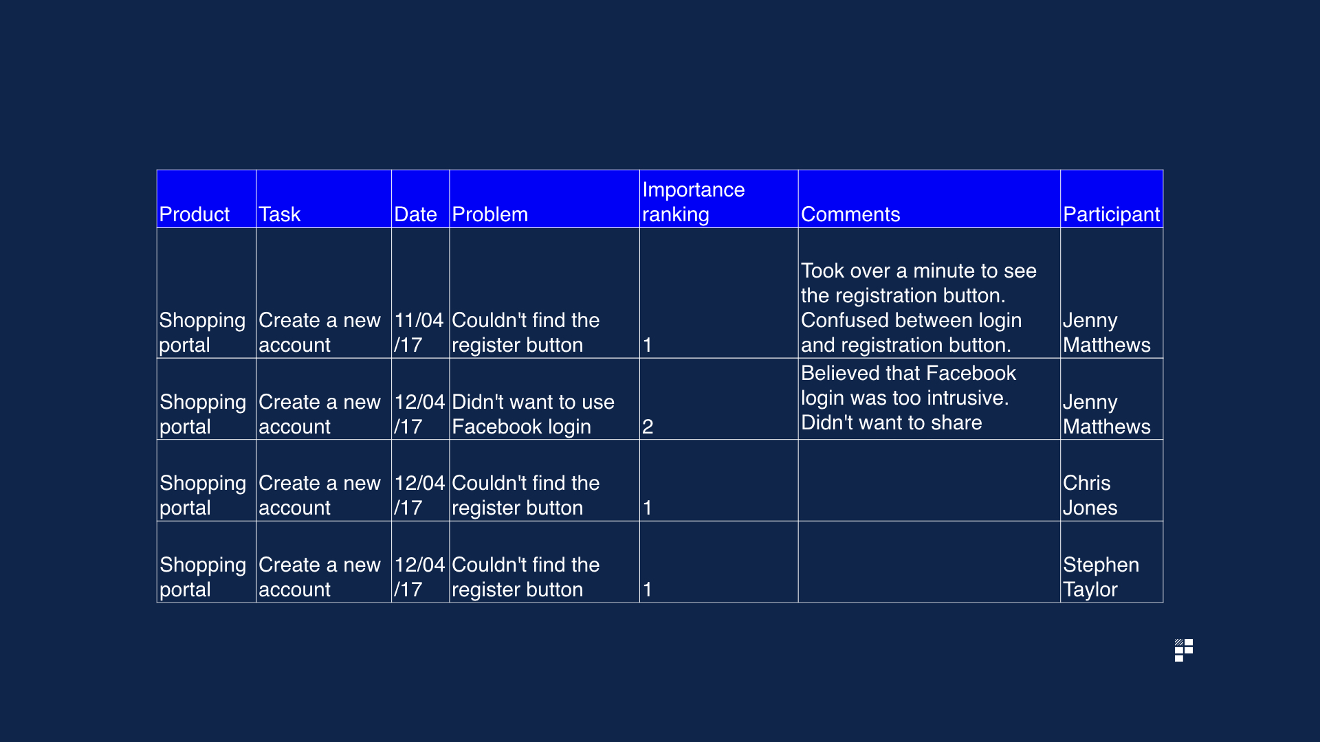
Stick to the same structure for each participant to ensure the data you collect is standardised. If you notice halfway through the testing that you’re missing a key field to capture relevant information, add it your structure.
Step 1 – identify common problems
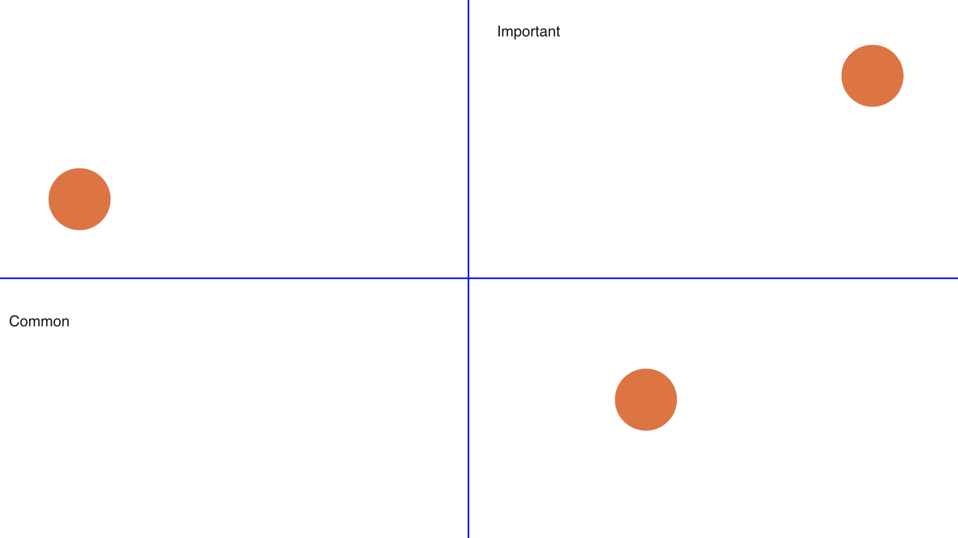
As we know, humans are an odd bunch and many users will uncover problems which impact them – and them only. If you’re looking to make the biggest impact across a wide spectrum of your users, aim to identify the most common problems your users experience first.
If you haven’t conducted any usability tests in a while, you’re likely to have a large amount of existing user journeys and potentially new prototypes to test out on your participants. In my experience, one of the most insightful aspects of usability testing is that you’re almost always going to find the same, or very similar problems, across a wide spectrum of users. These are often problems that you and your team had no idea about beforehand but once you get your product in front of a set of users you learn very quickly that it’s a problem that many users have in common.
A useful tip to make your life a lot easier here is to standardise the description or the summary of the problem in your table so that you can filter on this unique value later. Try to avoid describing the same problem in different ways as this will make analysing the most common problems more difficult.
For example, if it’s clear that user A is struggling to find the register button, you could summarise this as ‘Could not find register button’ for user A and user B and not as a unique description for each user. It sounds simple (and it is), but it’s easy to overlook the simple things when you’re drowning in feedback.
With your problems collated in 1 place, count the most common problems identified during the usability testing to give you a broad idea of the most commonly occurring issues your users are experiencing.
It makes sense to tackle the most common problems that arise – and to then assess these on a second dimension; the importance of these problems.
Step 2 – assess their importance
With your most commonly occurring problems identified, give the problem a importance ranking or score, where 1 = highest importance and 5 = lowest importance.
Plot your issues on 2 axes; common vs. importance. This will allow you to clearly visualise which issues are most commonly raised by users and how important they are to both your product strategy and your overall business.
Defining importance
This methodology sounds straight forward but a tricky question needs answering: how exactly do you define importance? Well, to assess the importance of a particular problem try asking yourself the following question:
If not fixed or changed, what impact will this have on a) the user’s goals (e.g. registering an account) and b) the business goals (e.g. increase registrations by 5%)?
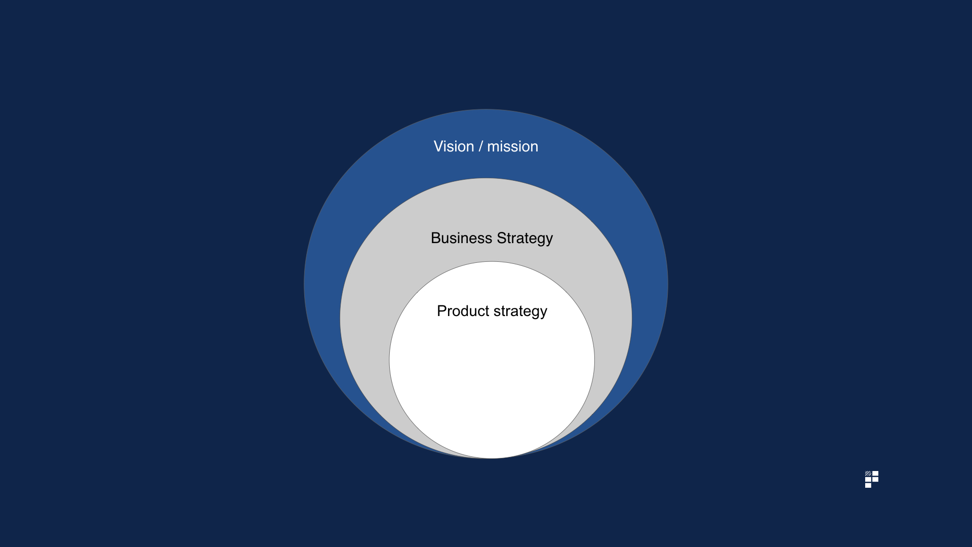
Re-engage with your overall product strategy and goals and identify the problems most likely to impede your success in achieving your goals or proving / disproving your key strategic hypotheses.
For example, if a key result / goal is to increase mobile app adoption by 10% YOY and you discover that users are struggling to complete your new mobile onboarding prototype it’s worth prioritising this since it aligns clearly with your product goals.
Step 3 – reflect
‘Pain + reflection = progress’ – Ray Dalio, billionaire investor
Once you’ve ranked your problems based on frequency and importance take some time to reflect on your overall product strategy, roadmap and goals and assess what impact the insights gleaned from these usability tests might have on your strategy.
It may be that your usability testing has thrown up some major questions about your product decisions and your strategic direction. If this is the case, you might need to consider shifting direction and / or modifying your roadmap to account for the issues raised during your usability testing sessions.
You’ll have a strong internal urge to ignore or gloss over anything which doesn’t align with your pre-existing strategic decisions. You’ll know that shifting course at this point is likely to provoke some resistance with your stakeholders. This urge to pretend everything went as planned is natural, but it doesn’t mean you should carry on as normal. Confirmation bias is not a product manager’s friend.
Sure, you shouldn’t change direction every time 1 single user raises something which deviates from your assumptions or quarterly roadmap. However, if your usability test results do show that an assumption for an upcoming feature or initiative needs to be revisited and you’re feeling a little daunted by the prospect of sharing this, there are ways to communicate this to the wider business and influence your stakeholders to bring them on board with your insights and subsequent recommended changes.
4 ways to influence stakeholders with usability test results
1. Use all-hands / demos to show video highlights

If you’ve wisely recorded your usability testing sessions, use the video content to demo in your next product all hands or department gatherings. This will shift the conversation away from ‘users’ and towards real human beings instead. User A becomes Anita, User B becomes Katy, User B becomes David.
Make sure your videos are edited down into easy to digest snippets so that your entire company isn’t bored to tears by being forced to watch an entire session. Focus on the most insightful parts of the sessions to demonstrate your points about why a particular aspect of the product is failing and to influence your stakeholders to agree with your suggested paths of remedy.
Usability testing videos can be particularly powerful when used during Product Council meetings. The Product Council acts as a forum to provide updates and to set the strategic direction of the product which makes usability demos an appropriate, insightful addition to that forum.
2. Visual comparisons with competitors / other products

‘The frankenstein product on the left is ours and the beautifully simple and elegant startup on the right is our competitor. Anyone disagree we should streamline the product?’
In larger organisations in particular, it’s easy to fall victim to creating a fairly ugly frankenstein composed of every stakeholder’s wishlist items. The rise of componentised software development using frameworks doesn’t help in this respect since you often lose the overall perspective of your product, particularly, if the teams working on these components are not aligned. The resulting confusion caused by this approach is often surfaced during usability testing sessions.
To illustrate this point clearly, grab yourself a screenshot of your product and put it directly next to a screenshot of your competitor or new entrant to the market to make it plainly obvious just how confusing your product has become over the ages.
Use the audience’s reactions as fodder to make clear suggestions for spring cleaning your product by retiring unused features.
3. Emotion mapping
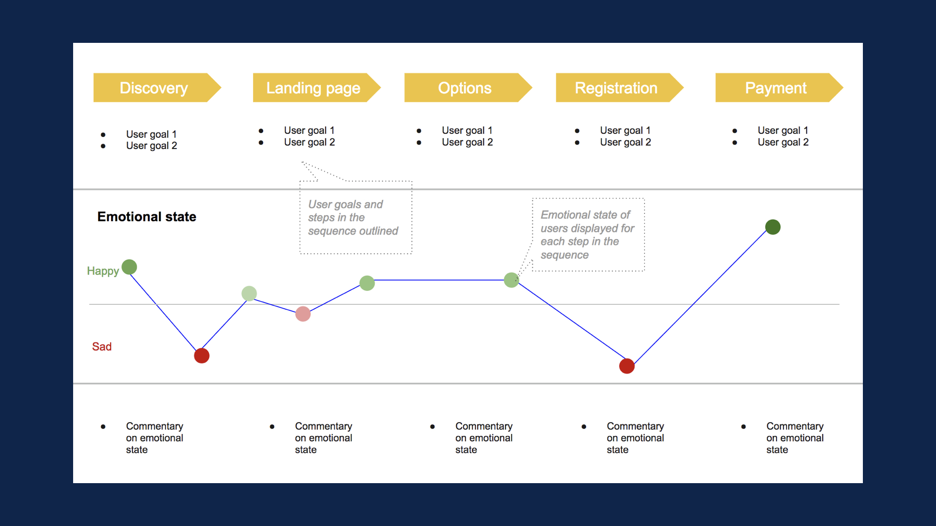
The emotion mapping tool is a powerful tool used most commonly by UX professionals to communicate to your stakeholders the points at which your users become unhappy throughout your existing journeys. If you’re having difficulty articulating the impact a specific journey is having on the overall user flow, the emotion mapping tool is a great way to bring this to life by demonstrating the changes in user emotion as the user progresses through the journey.
4. Link problems surfaced back to metrics and business goals

Perhaps the best way to illustrate the importance of problems surfaced during usability testing and to subsequently get stakeholders on board with your suggestions is to link the problems surfaced back to explicit business goals.
For example, if 7 / 10 of your usability test participants couldn’t find a button which prompts users to create an account and you know that account creation is an important factor in repeat purchases you could link this explicitly back to a rough estimation of lost revenue. Clearly, this is by no means scientific since you’re working with such small sample sizes but linking common and serious problems back to overall business / commercial goals will, if nothing else, demonstrate that you have both the user’s and the business’ interests at heart.
Product tools for assisting with usability testing
- Camtasia – tool for recording usability testing sessions
- Inspectlet – allows you to play back everything your users do on your site
- Jing – screen capture software, allows you to take screenshots, record videos and audio on your desktop
- Loom – simple, quick, easy to use Chrome extension allowing you to record videos in the browser
- ScreenFlow – the classic screen recording software. Comes with plenty of special effects for jazzing up your videos. Useful if sharing videos with third parties.
- Silverback– app for Mac dedicated exclusively to conducting usability tests

