Product strategy templates
Diagrams to help you develop and communicate your product strategy
As product managers it is your responsibility to drive the vision and the strategy for your products. When your stakeholders ask for your product strategy this can be a daunting task where you can feel overwhelmed by the sheer number of potential ways for your product to develop.
All yours. All free.

In this series of diagrams by the Department of Product, we help you to visualise your product strategy.
Create a clearer vision
By visualising your strategy you will have a better, clearer understanding of where your product is headed, who your competitors are and why your product is different
Reinvent the way you share information
Transform your text-heavy slides which nobody reads into engaging visual diagrams which clearly demonstrate your strategy that can be shared throughout your organisation
Communicate with clarity
You will be able to clearly communicate your strategic direction to the rest of the business so that they fully understand where your product sits in the market today and where the product might sit tomorrow.
All yours. All free.
What’s included?
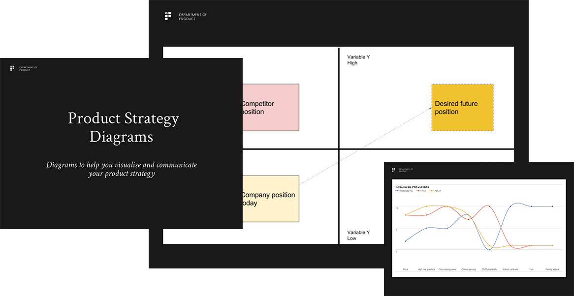
The strategy canvas
Used to convey to the rest of the business and your team why your product is set up to compete and add unique value to your market. The canvas explicitly plots your product’s factors vs competitors to visualise why your product is different. List your competing factors vs. competitors in a table first using a 1-10 scoring index and create the graph to visualise the differences.
The market map
Use an X and Y axis to choose 2 useful variables that can be used to demonstrate differences between your product and competitors for example price and quality. The market map is used to communicate where your product sits in the market today and where you want it to be in the future.
The long tail
Created by Chris Anderson to explain how technology has created a longer tail of niche products, creating new opportunities for both businesses and consumers. For example, the proliferation of web services such as Netflix means niche films are now more likely to get watched by a global, dedicated audience than they would if their opportunity to be watched was limited by the physical shelf space provided by Blockbuster Video.
The venn diagram
A series of interlocked circles to show areas of overlapping characteristics.
The extent to which the circles overlap can be roughly mapped to a % which equates to the % of overlap between the characteristics.
The extent to which the circles overlap can be roughly mapped to a % which equates to the % of overlap between the characteristics.
The satellite system
Use of circles to communicate a central idea, objective or concept, with outer circles used to support the central circle, like a satellite of planets. Used to demonstrate how ideas, processes or products are interconnected and how they support a central vision, idea or objective.
All yours. All free.
